Digital Podge 2009
Dadi Award 2010 Best use of visual design
BIMA Award 2010 Visual design
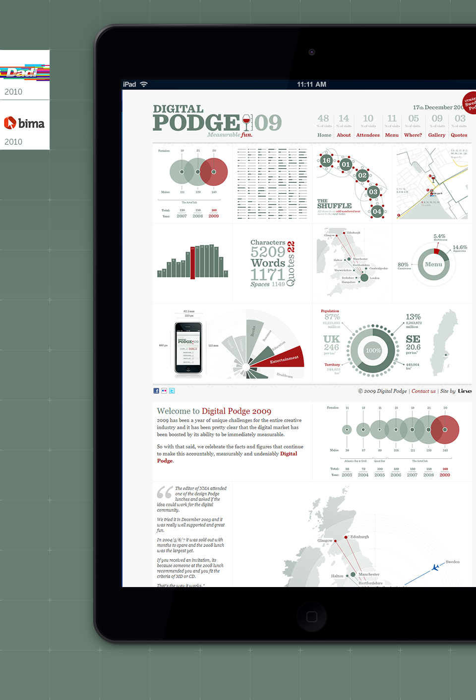
The digital industry social event of the year required a theme, concept and design for their brand, website and collateral. Every year they have an agency work on something, and in 2009, it was Line's turn.
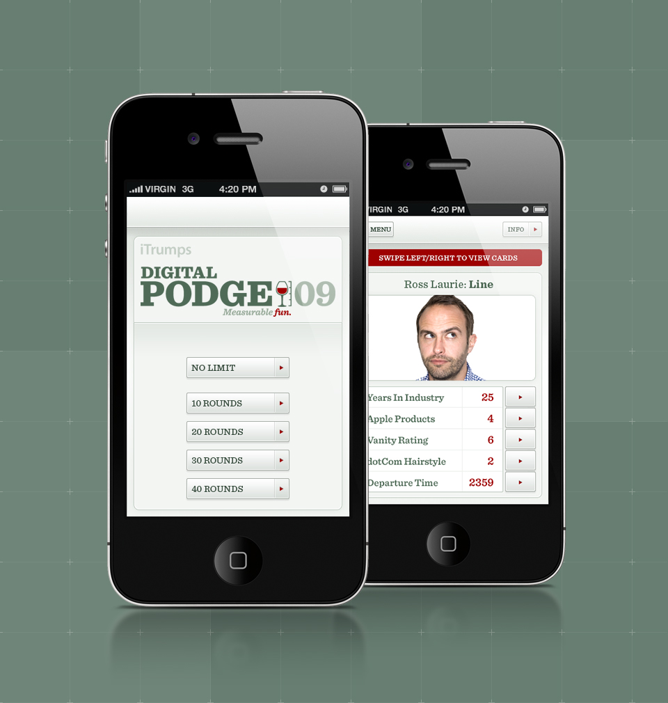
As a senior designer at Line, I was involved in website, infographic and iPhone app design.
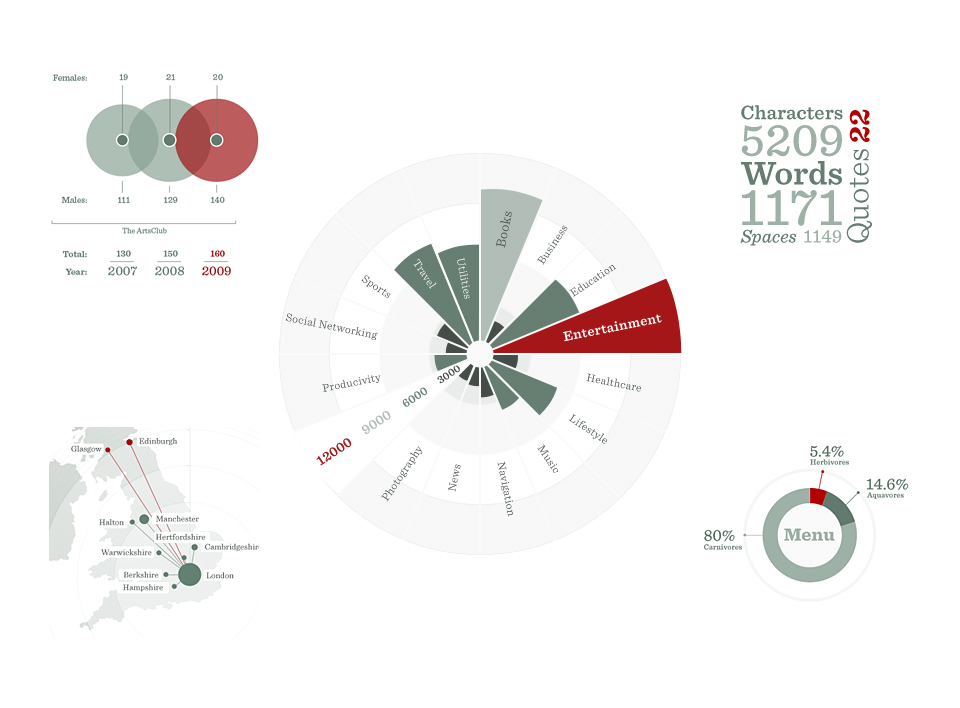
Clever and often humorous use of infographics allowed us to create a variety of deliverables across the devices. From the navigation on the site, to the name cards, which doubled up as local-area maps - which were in turn duplicated on the site, with layers that could be toggled on and off.
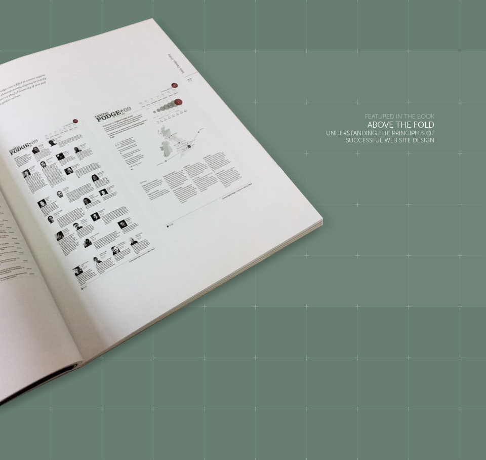
The website, brand, menus, seating boards, name cards, t-shirts, posters, wine-cards and everything else were received very well, and stood out as one of the best themes that the event has had since its inception. The site proved such a success, it was duplicated and altered to be used for Swedish Podge in 2010.
Details
- Client:
- Digital Podge
- Date:
- 2009
- Company:
- Line Digital
- Role:
- Website and iOS app design, Concept design


